Dissemination may involve use of different techniques for visualisation of the result. Geographic Visualisation or geovisualisation typically refers to a set of tools and techniques supporting geospatial data analysis through the use of interactive visualization. But geovisualisation also encompasses use of cartograms.
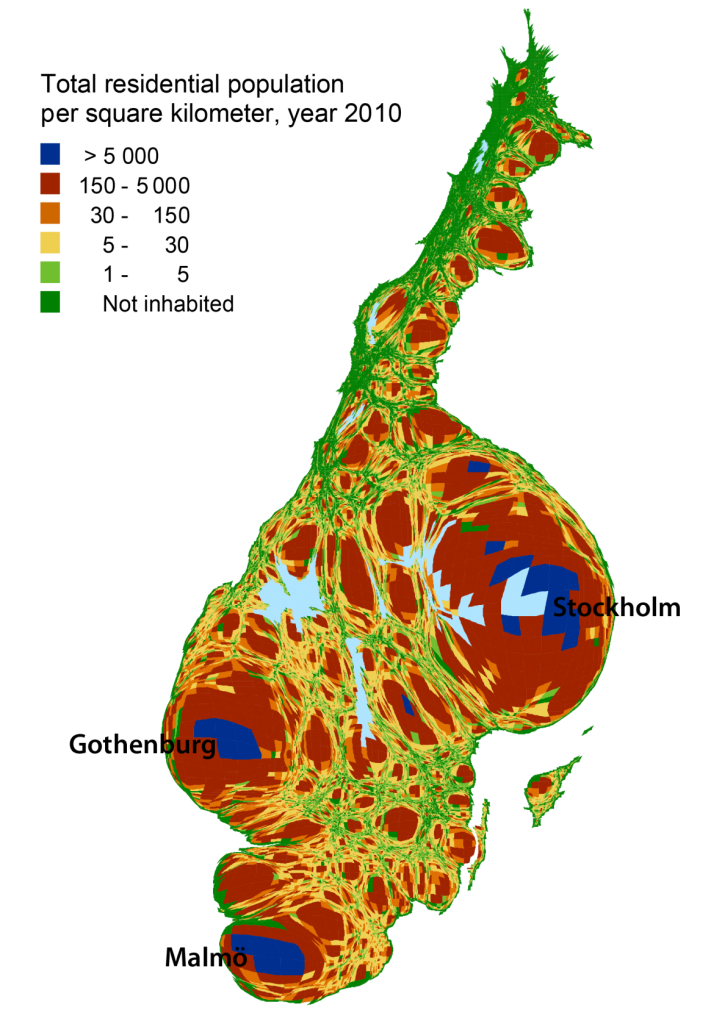
This is what Sweden would look like, if mapped from a population point of view. Every square in the population grid has been rescaled in proportion to the number of inhabitants it holds.
The Swedish population is unevenly distributed across the country, 85 percent of the population is concentrated to localities which occupy only 1.3 percent of the land area.
This particular kind of thematic map is known as a cartogram or value-by-area map. There are two forms of cartogram, contiguous and non-contiguous. The geographical objects don’t have to maintain their connectivity in an non-contiguous cartogram, thus the objects can vary in size but still maintain their shape. The contiguous cartogram will hold the connectivity between the geographical objects but this causes a distortion in shape. The map of the Swedish population is created as a contiguous cartogram.
Contact: Stefan SVANSTRÖM at Statistics Sweden

